

Color Combinations For Home Decor - Classics & More
Bold, Colorful Home Decor In a Sherpa Throw Blanket.
Introduction to color combinations
When it comes to interior design, one of the most powerful tools at your disposal is color. It has a huge effect on home decor. The right color combination can completely transform a space from drab and uninspiring to fabulously stylish. Understanding the principles of color theory and the psychology behind different hues is essential in creating a harmonious and visually appealing environment. In this article, we will delve into the world of classic color combinations and explore how they can breathe new life into any room.
Understanding the color wheel and basic color theory
Before we dive into the world of classic color combinations, let's take a moment to understand the color wheel and basic color theory. The color wheel is a visual representation of the relationships between different hues. It consists of primary colors (red, yellow, and blue), secondary colors (orange, green, and purple), and tertiary colors (a mix of primary and secondary colors). By understanding the position of each color on the wheel, you can easily identify complementary (opposite) colors, analogous (adjacent) colors, and triadic (equally spaced) colors. This knowledge is crucial in creating harmonious color combinations that are pleasing to the eye. From here, room color schemes can can be created depending on the goal.
The psychology of color in interior design
Color has a profound impact on our emotions and can evoke different feelings and moods. Color makes the feel of a room. Warm colors like red, orange, and yellow create a sense of energy and excitement, making them perfect for social spaces like living rooms and dining areas. On the other hand, cool colors such as blue, green, and purple have a calming effect and are ideal for bedrooms and relaxation areas. Neutral colors like beige, gray, and white provide a versatile backdrop that can be paired with any other color to create a soothing and sophisticated atmosphere. Understanding the psychology of color is crucial in determining the mood you want to convey in each room. Once you know the mood you want the perfect colors can be chosen. It is all about color pairings.

Black and Whites Bring Great Style to Home Decor.
Different types of color combinations
There are various types of color combinations that can be used to achieve different effects in your interior design. Complementary colors, as mentioned earlier, are colors that are opposite each other on the color wheel. When used together, they create a striking contrast that can add visual interest and balance to a space. Analogous colors, on the other hand, are colors that are adjacent to each other on the color wheel. They create a harmonious and cohesive look when used together. Triadic colors, as the name suggests, involve three colors that are equally spaced on the color wheel. This type of combination is vibrant and energetic, but it requires careful balancing to avoid overwhelming the space.
Classic color combinations that never go out of style
Now that we have a basic understanding of color theory, let's explore some classic color combinations that have stood the test of time. These combinations are versatile, timeless, and can be used in a variety of design styles. One classic combination is turquoise, cobalt, and sky blue. This trio of cool tones creates a serene and soothing atmosphere, perfect for bedrooms or beach-inspired living spaces. Another classic combination is beige, blue, green, and gray. This earthy palette brings a sense of calm and tranquility to any room, making it perfect for creating a cozy reading nook or a relaxing home office.

A Sherpa throw blanket makes a great addition for home decor and comfort.
Using complementary colors to create contrast and balance
Complementary colors, as mentioned earlier, are colors that are opposite each other on the color wheel. They create a striking contrast when used together, adding visual interest and balance to a space. For example, pairing vibrant orange with deep navy blue can create a bold and energetic atmosphere in a living room or study. The key to using complementary colors effectively is to strike a balance between the two hues. You can achieve this by using one color as the dominant shade and the other as an accent. For instance, painting the walls in a neutral tone and adding pops of orange and navy through furniture and accessories.
Monochromatic color schemes for a sophisticated look
If you prefer a more subdued and sophisticated look, a monochromatic color scheme might be the perfect choice for you. A monochromatic scheme involves using different shades and tints of a single color. For example, a room designed in various shades of blue creates a serene and cohesive atmosphere. To avoid monotony, make sure to incorporate texture and pattern into the space. For instance, use a mix of light and dark blue fabrics, add a patterned rug, or introduce metallic accents to create visual interest.
Creating a cohesive color palette for small spaces
Designing a small space can be challenging, but with the right color palette, you can create an illusion of space and make the room feel larger. When working with a small space, it is important to choose colors that are light and airy. Light neutral colors like white, beige, and pale gray are ideal for creating a sense of openness. You can then add pops of color through accessories and artwork to bring personality and vibrancy to the space. Another trick is to use mirrors strategically to reflect natural light and create a sense of depth.
Choosing the perfect backdrop for your living space
The backdrop of a room sets the tone for the entire space. When choosing the perfect backdrop, consider factors such as natural light, room size, and the overall mood you want to create. If you have a room with ample natural light, you can experiment with darker colors like charcoal or navy blue. These rich hues can add depth and drama to the space. On the other hand, if you have a small room with limited natural light, it is best to stick to lighter colors like white or pastels. These colors will help reflect light and make the room feel more spacious and airy.
Accent colors and how to use them effectively
Accent colors play a crucial role in adding personality and depth to your room design. They are the pops of color that catch the eye and draw attention to specific areas or elements in the room. When using accent colors, it is important to use them strategically and sparingly to avoid overwhelming the space. One effective way to use accent colors is through accessories like throw pillows, blankets, and artwork. For example, if you have a neutral color palette, you can add a vibrant red throw blanket to create a focal point and add a touch of warmth. This is also where all the different colors and different tones can play a role.
Incorporating vibrant colors into your room design
Vibrant colors can add energy and excitement to your room design. Whether it's a bold red statement wall or a vibrant yellow sofa, incorporating vibrant colors can instantly transform a space from ordinary to extraordinary. When using vibrant colors, it is important to balance them with neutral tones to avoid overwhelming the room. For instance, if you have a vibrant red accent wall, balance it with neutral furniture and accessories. You can also use vibrant colors in small doses through artwork, rugs, or curtains to create visual interest without overpowering the space.
Using neutral color combinations for versatility
Neutral colors are a popular choice for interior design as they provide a versatile base that can be easily paired with any other color. From classic whites and beiges to modern grays, neutral colors create a timeless and sophisticated look. When using neutral colors, it is important to consider the undertones. Warm neutral colors like cream and beige pair well with earth tones and warm colors, while cool neutral colors like gray and white complement cool colors and metallic accents. By starting with a neutral base, you can easily change the look of a room by simply swapping out accessories and accent colors.
Taking a Deeper Dive into the World of Classic Color Combinations
Let's embark on a journey through a kaleidoscope of classic color combinations, each with its own timeless charm. Here are some way over the top description of these classic color combinations. The point is it that these color combinations can tell a story when used in different space.
Turquoise + Cobalt + Sky Blue Imagine a symphony of blues, where turquoise whispers the secrets of shallow seas, cobalt narrates the depth of the ocean, and sky blue sings the serenity of the heavens. Together, they weave a tapestry that echoes the tranquility of a beachside haven or the peaceful embrace of a bedroom where dreams float like clouds.
Beige + Blue + Green + Gray This quartet sings a ballad of the earth, where beige is the soft murmur of sand underfoot, blue reflects the endless sky, green mirrors the whispering leaves, and gray captures the solemnity of a stoic mountain. Ideal for spaces that yearn to echo the quiet corners of nature, offering a sanctuary of calm in a living room or a study.
Charcoal + Creamy White + Linen In this elegant dance, charcoal's bold strokes paint a canvas of night, creamy white adds a touch of moonlight's grace, and linen brings the warmth of dawn's first light. A palette fit for spaces that speak of timeless sophistication, like a formal dining room or a bedroom wrapped in luxury.
Creamy White + Brown + Leaf Green Here, creamy white is the canvas of tranquility, brown the essence of the earth's embrace, and leaf green the burst of life in a forest glade. It's a color story that invites the coziness of a rustic kitchen or the heartwarming charm of a living room steeped in farmhouse elegance.
Indigo + Gray + White In this trio, indigo is the deep velvet of a starless night, gray the whisper of dawn's first light, and white the purity of daybreak. A modern, sophisticated blend perfect for a contemporary living room or a bedroom that speaks in hushed tones of minimalist elegance.
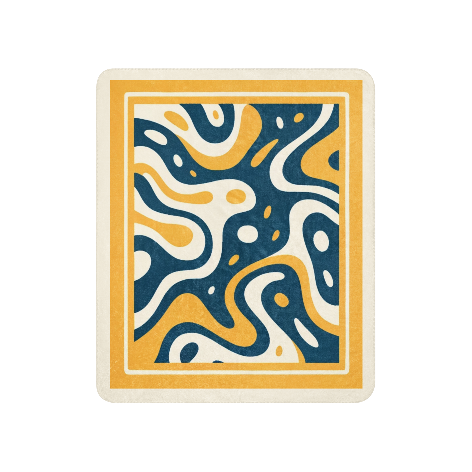
Bright White + Orange + Navy Bright white is the canvas of possibility, orange the spark of playful energy, and navy the anchor of depth and stability. This vibrant mix is a celebration of life, ideal for a children's room brimming with imagination or a home office buzzing with creativity.
Greige + Cream + Russet Greige is the subtle harmony of gray and beige, cream the softness of a gentle embrace, and russet the rich warmth of autumn leaves. Together, they create a cozy, inviting atmosphere, perfect for a traditional living room or a reading nook that beckons with a warm welcome.
Silver + Seafoam Silver is the shimmer of moonlight on water, and seafoam the gentle caress of the ocean's edge. This cool, airy combination is like a breath of fresh sea breeze, ideal for a bedroom that dreams of coastal escapes or a bathroom that echoes the tranquility of a spa retreat.
Earthy Greens + Yellow Earthy greens are the chorus of a forest in full bloom, and yellow the burst of sunlight through the canopy. This vibrant duo brings the outdoors in, perfect for a bohemian-style living room or a kitchen that buzzes with the energy of life.
Navy + Bright White + Yellow Navy is the depth of the ocean at night, bright white the crest of waves in the sun, and yellow the joy of sunlight dancing on the water. A nautical, cheerful trio, this combination is perfect for a beach house bedroom or a coastal-inspired space where laughter rides on the sea breeze.
The classic color combination space is the space that MTRobinsons.com has focused one when creating there Classic Color Combos Sherpa Thrown Blankets. Our designs are on the dynamic side. We can also personalize the blankets to the colors our clients want that matches their paint color scheme or green sofa. We can help outfit them with accessories that work with their perfect color combination.
Red, White and Cream Throw Blanket - Great for accent color.
The role of accent pieces like throw pillows and blankets in color combinations
Accent pieces like throw pillows and blankets play a crucial role in adding the finishing touches to your color combinations. They are the cherry on top that ties everything together and adds personality to the space. When choosing accent pieces, consider the colors already present in the room and select fabrics and patterns that complement the overall color scheme. For example, if you have a room with a neutral color palette, you can add throw pillows in vibrant colors or bold patterns to create visual interest. Likewise, if you have a room with vibrant accent walls, opt for more subdued and neutral accent pieces to create balance.
Experimenting with different color combinations for a personal touch
While classic color combinations provide a timeless and foolproof option, don't be afraid to experiment and add your personal touch to your room design. Your favorite colors and unique preferences should be reflected in your space. Consider creating mood boards or using online design tools to visualize different color combinations before making a decision. Play with different shades, tones, and textures to create a space that truly resonates with your personality and style. The beauty of interior design is that it allows for endless creativity and self-expression, so embrace the opportunity to make your space truly your own.
Conclusion: Embracing the power of classic color combinations
In conclusion, classic color combinations have a transformative power that can turn any space from drab to fab. By understanding the principles of color theory, the psychology of different hues, and the various types of color combinations, you can create a harmonious and visually appealing environment. Whether you opt for complementary colors, monochromatic schemes, or vibrant accents, the key is to strike a balance and create a cohesive color palette that reflects your personal style and enhances the mood of each room. So, don't be afraid to get creative and experiment with different color combinations. Your living space is your canvas, and the possibilities are endless.
Check Out Our Classic Color Combos Line of Sherpa Blankets
If you're feeling inspired to incorporate classic color combinations into your home, be sure to check out our Classic Color Combos line of Sherpa blankets. These cozy and stylish blankets come in a range of classic color combinations, from soothing neutrals to vibrant pops of color. Wrap yourself in comfort and style while adding the finishing touch to your room design. Visit our website to explore our collection and find the perfect Sherpa blanket to complement your color palette.